WP photo portfolio
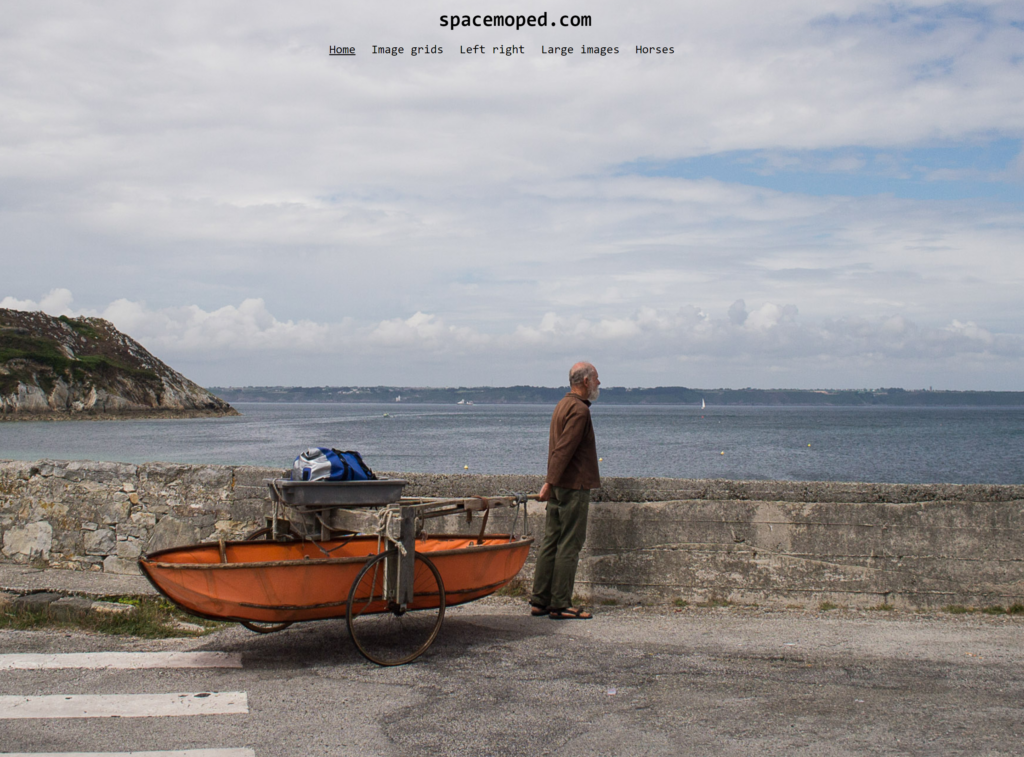
This is my own playground (spacemoped.com) temporarily set up as a photo portfolio.
Contents:
- Clean up the site
- Media settings for image sizes
- Make a front page
- Set focal points on your photos
- Why make a transparent header?
- Text Colour for Header and navigation
- Image grids
- Story with large images
This write up will guide you through using WordPress with free themes and plugins to set up a photography portfolio site. It’s really just a pretty normal site, but with some extra emphasis on layouts that are good for showing images, agallery plugin and a plugin to set a focal point in the images.
The aim of this is to make three differnet pages (A frontpage, a grid based page and a photo story) that together can form a skeleton portfolio site.
Required:
- WordPress.org based installation version 6.5 or higher (not wordpress.com!)
- Admin rights to this installation.
- Generateblocks plugin for layout control
- Metaslider or similar slideshow plugin.
- WP Smartcrop plugin
Reccommended:
- Generatepress theme or child theme, or theme with a full width page layout template.
First, let’s clean up everything!
A starter template for a web page often has a lot of sidebars, boxes and other areas that just fill the space, especially when starting a new page. This article is about making a photo portfolio so getting rid of clutter is a good start. This is what the frontpage looks like on a fresh install and with the Generatepress theme installed.
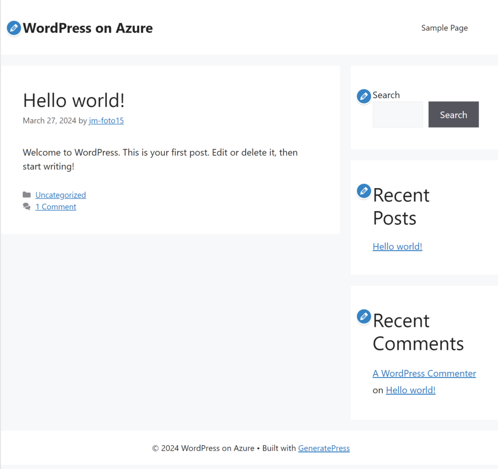
We will remove the entire righthand sidebar and hide the header and footer. We want out front page where the content is displayed (‘Hellow world!’)
This doesn’t look much like a photo portfolio yet so lets get to work:
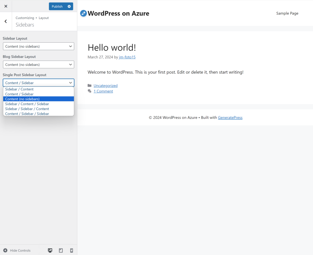
Disable the sidebar
Appearance > Customize
Layout > Sidebars
For a photo site I reccommend Content (no sidebars) on all three options. This gives us the entire page to display images as large as we want.
Later we will adjust the header (transparent) and footer (hidden) to further clean up the site.
It is time to think about the images we want to display on the site…
Set up your image sizes before uploading images to the Media library.
In WordPress images are managed in the media library. When you upload an image wordpress will generate three downscaled versions at the sizes set in your ‘Media settings’ at the time you upload.
Don’t worry if you already have uploaded images in your media library there is a plugin to fix it and its called Regenerate Thumbnails. That plugin takes a while to chew through your photos in your Media Library and rescales them to your preferred sizes. If you want to do that then first decide on your preferred image sizes and then run the plugin.
WordPress will normally give you three image sizes, ‘Thumbnail’, ‘Medium’ and ‘Large’ plus the original size you uploaded which is ‘Full size’.
As a general rule when you add an image from the media library to a page you should choose the smallest size that fills the space on the page. If you choose the ‘Full size’ version and place it in a small space on the page you are wasting bandwidth on your server and on the users end. This can be significant, especially on mobile connections. On the other hand if chosen image size is too small it might not position itself properly or get too upscaled and blurry.
So let’s set your image sizes right now:
Go to Settings > Media
Here you can set your preferred image sizes. In my opinion the largest image size should fill your content container. The content container is the maximum width of the content on a typical web article, such as this. Theh content container on this page has a white background colour, and the space around it is a light grey. Typically you want to limited the width if you have mixed text + image content on a page. Text becomes less readable if it fills the entire width of a computer screen so that is not recommended, but images can look great in full width. On a phone screen its completely different regarding the text, but we will get back to that.
My preferred image sizes:
- Thumbnail: Max width & height: 256px and I also prefer ‘crop thumbnail’ to be off.
- Medium: Max width & height 512
- Large: Max width & height 1024 px
- Upload size: Max width and/or height 2560 px*
*This is not an absolute rule, but at the time of writing this seems like a good compromise that can give good image quality across a range of different screen sizes.
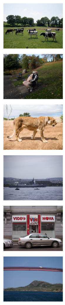
Here are examples from my Media Library in Full size, Large, Medium and Thumbnail:
Picture size examples
Full size 2560 px wide:

Large, 1024 px

Medium, 512 px:

Thumbnail, 128 px:

If you want all your thumbnails to be cropped to the same aspect ratio you can, just be aware that portrait aspect ratio (2:3 or 3:4) might be cropped a bit randomly, probably the center part of either direction. The ‘Wp smartcrop’ plugin might help with that and is described further down.
Once you have set the images sizes in your Media settings, go ahead and upload your 2560px images as Full scale images. I don’t recommend full resolution images from your camera, its too BIG!!
Make a front page
The aim is a clean front page and several of us in the class agreed that the Jonas Bendiksen site was nice. Here it is:
https://www.jonasbendiksen.com
It puts the image first and has a nice clean title and menu on the top of the page. In web language we would say it has a transparent header. The header is the top of a webpage that normally holds the site title and main menu, just like here. Having the background colour of the header transparen and placing the image all the way to the top is a nice choice for a simple portfolio page.
Let’s make the page. Go to:
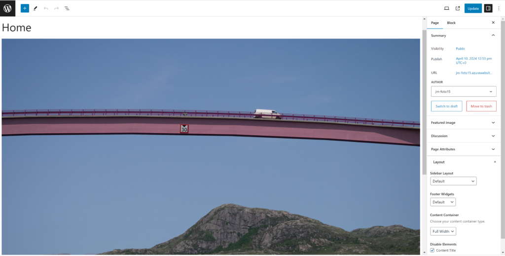
Page > Add new
Then in Page settings (right hand panel) like this
Scroll down towards the bottom of that panel until you find:
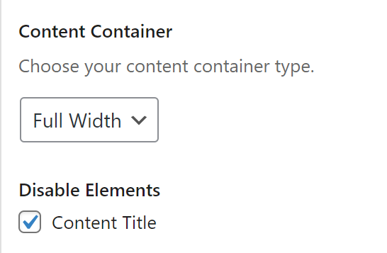
Choose ‘Full width’ and also to disable the Content title. This title still matters because by default it will be the clickable label in the menu when this page is added to the menu. So you could name it ‘Home’, ‘Front page’, ‘Your name’ etc…
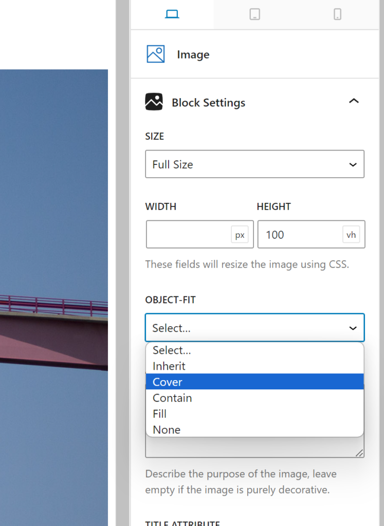
Then insert an image from the Media library using the Generateblocks image element (blue). With the ‘Full width option for this page the image will cover the entire width.
Choose how your image will be displayed
- You can use ‘Full Size’ for images that will cover the entire width of the screen.
- Setting a height of 100vh will make the image cover the entire height of the screen, but it might get cropped sides on upright mobile screens, and blank fields on the side on ultrawide monitors.
- In my opinion 100vh works best for most images
- Object fit can be set to Cover if you allow your image to be cropped
- If you don’t want the image to be cropped you can choose ‘Contain’ instead. The image will appear small on upright mobile screens but will not be cropped.
Use the smartcrop plugin to set a focal point
This can be done in the Media Library at any time but requires the ‘WP Smaprtcrop’ plugin.
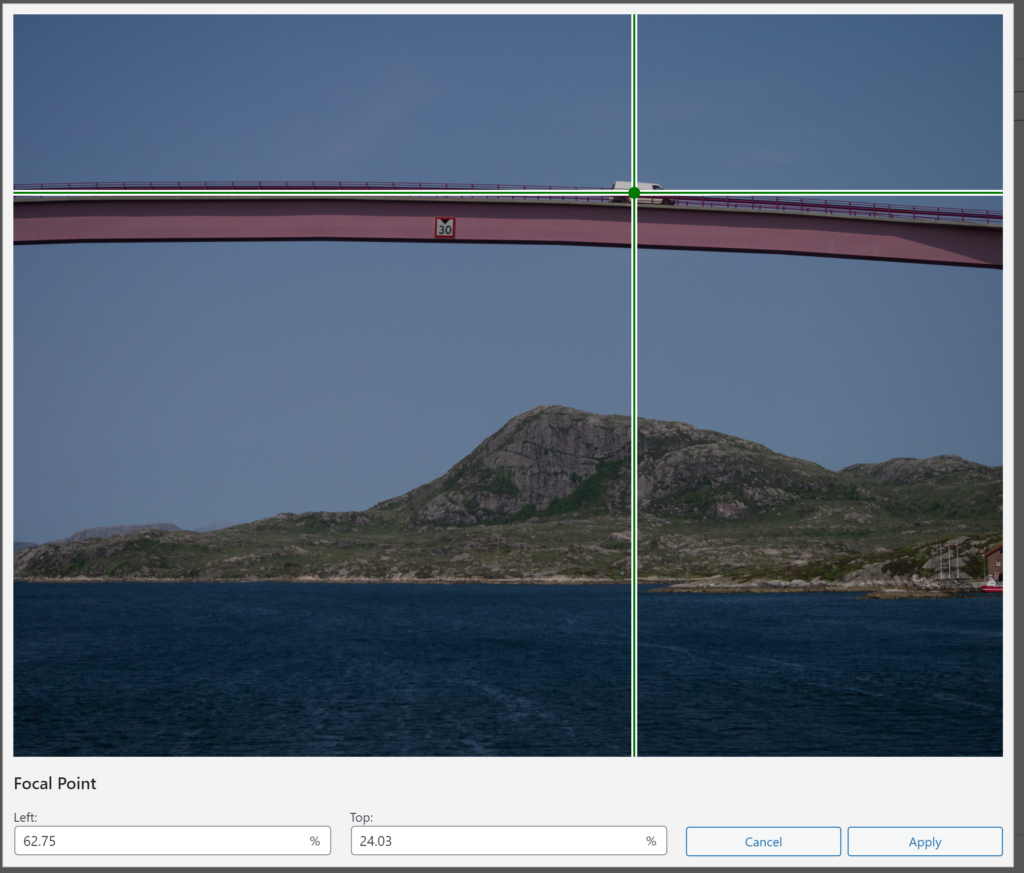
Notice on the jonasbendiksen site how the main subject is off center but that the subject stays on screen regardless of the screen size? If your image has a main subject that is off center you need the smartcrop plugin (or similar) to set a focal point. There are a few plugins that allow you to set a focal point in the image. I tried a few and found smartcrop to be easiest to use and to give good results.
Note that on mobile preview inside the wordpress page editor you will not see the ‘smart crop’ but a centered crop. Take a look at the page preview with emulated phone view or on your actual phone to see it in action. It works!
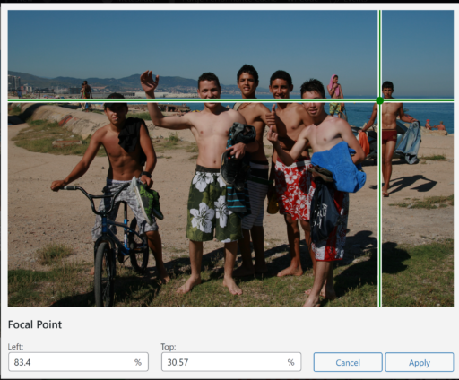
Set focal point

Page editor mobile preview doesn’t show smart crop
Preview with mobile emulation in chrome confirms smart crop is working
First you see where to set the focal point with smartcrtop. Next notice you still see a centralized crop in WP page editor. Finally preview in new tab on emulated iPhone 5 view confirms the focal point crop is working. As a photographer you might not like your image cropped on different screens. The option is to show the entire image but scaled very small on mobile screens in upright mode.
If your Front page has the one full width photo you can go ahead and publish your Home page..
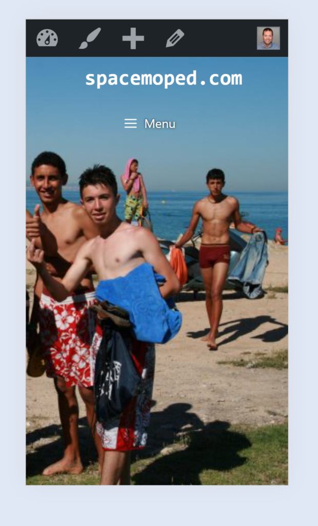
Transparent header with image behind

On a portfolio page with relatively few menu options a transparent header with a carefully chosen image behind it can be a good choice. When chosing an image you should take one with a realtively evenly bright top of the image.
For text to be readable on top of an image we should use either black or white text. The example above (spacemoped.com) works best with black, while the example below (‘Junglejuice’) might work better with white text.
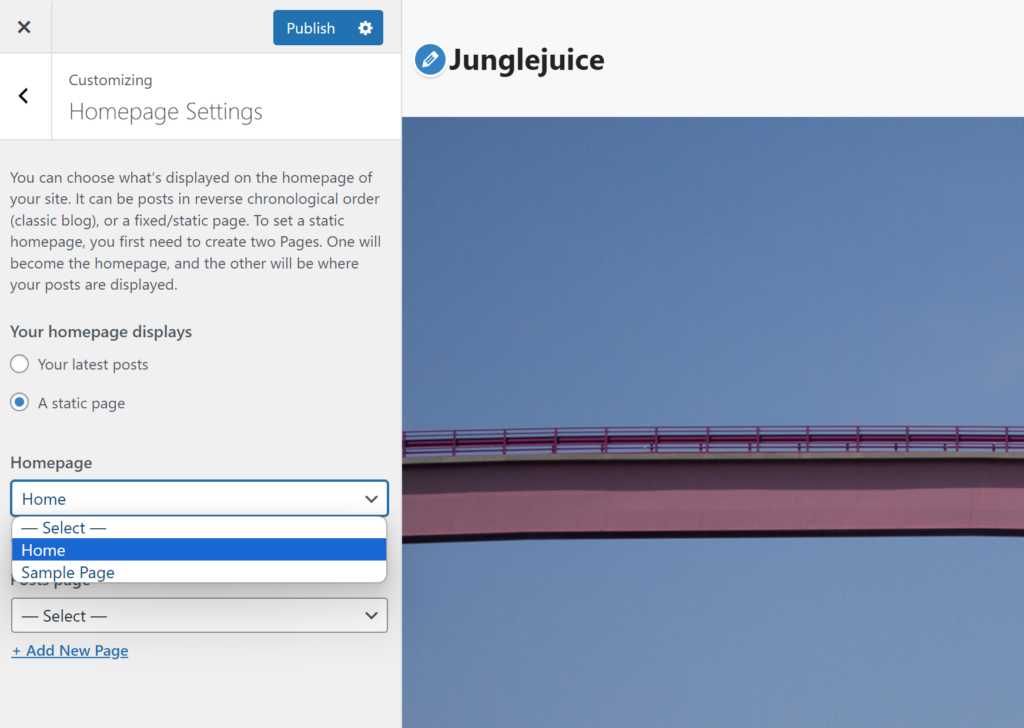
Making the header transparent and allowing the image on the page to go all the way to the top of the screen requires some CSS, but you should mostly get away with copy pasting and you might have to find something called page-id, but we will get back to that. First we neeed to set the page we just made as our front page:
- Appearance > Customize
- Homepage Settings
- Choose for your homepage to display ‘A static page’
- Choose the page you just made (‘Home’) as the front page.
Notice on the Jonas Bendiksen page that on any of the sub pages the text in the header is black, but on the front page that text is white on top of a big background image. We want white header text (site title and navigation) on the front page, but on the other pages we want it to be black. This requires a bit more of a hacky solution but it is perfectly doable. What we do then is to go to the generatepress color panel and set the ‘Site Title’ color and ‘Navigation Text’ to black in all states. Rather than using a colour code for black choose a black colour from your global colours. If you don’t have a black in global colours just make one.
Making the header transparent
In order to get transparent header and navigation you have to set the background colours for these element to nothing. Simply click on Header > Background and Navigation > Background and delete whatever colour value is in the field.
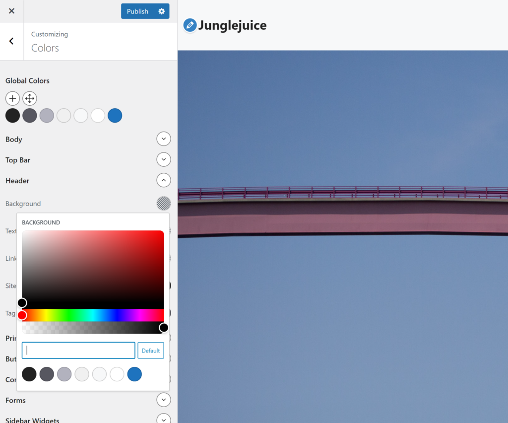
Do the same for Navigation background.
The header in the image above is actually transparent, but because the image is positioned just below it there is nothing there so the browser renders it white. We need to collapse the height of the header with CSS (described further down) to make the image appear behind it.
Text colour for header and Navigation
Setting the color to black for ‘Site Title’ and ‘Navigation Text’ will make these appear black on all pages on the site. But we want to make an exception on the front page because Jonas did this and we agreeed it was nice. In that case we make an exception for the front page (‘Home’) so that becomes white.
Make front page header and navigation white with CSS
We want some CSS that turns these text bits white only on the front page. In order to achieve that we have to find the page-id for the page we have set to be the front page. This will be different for all pages on all sites, so you have to find the relevant page-id for your front page. If you can’t find it on your page just send me an email on gauheg@oslomet.no with a link to your page and I will find it for you (this is for my students!).
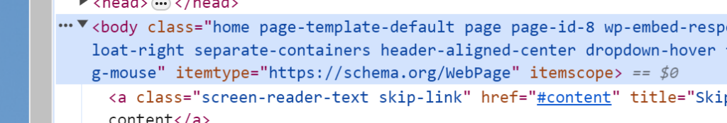
In the mess of code I can see ‘page-id-8’. This is what i need to make a CSS rule (white text) only for this page.
You need to use the developer tools and find the <body> element which is highlighted in the image above. Notice that after body it says class=”… and then a bunch og stuff. A bit further on the line it says page-id-2472. Your page id will most likely be something else but that is what you need to find and you should be able to see it using the inspector.
Again, if you want this but can’t find the page-id just email me 😉
Ok, time for some CSS hacking to make this work.
}
 .page-id-8 .site-header a{
		color: white;
}
 .page-id-8 .site-header a{
		color: white;
	 text-shadow: 0px 0px 20px rgba(0,0,0,0.5);
}

.page-id-8 .main-navigation{
		height: 0px;
}

.page-id-8 #masthead{
	height: 0px;
}

div.inside-navigation{
	top: 40px;
}

.page-id-8 .main-navigation .main-nav ul li a{
		color: white;
	text-shadow: 0px 0px 20px rgba(0,0,0,0.5);
}
Copy the CSS above and paste it in:
Appearance > Customize
then click:
Additional CSS
Paste the CSS.
Click ‘Publish’
Rememeber that the page-id-8 will only work on my page, you need to find your own page-id!
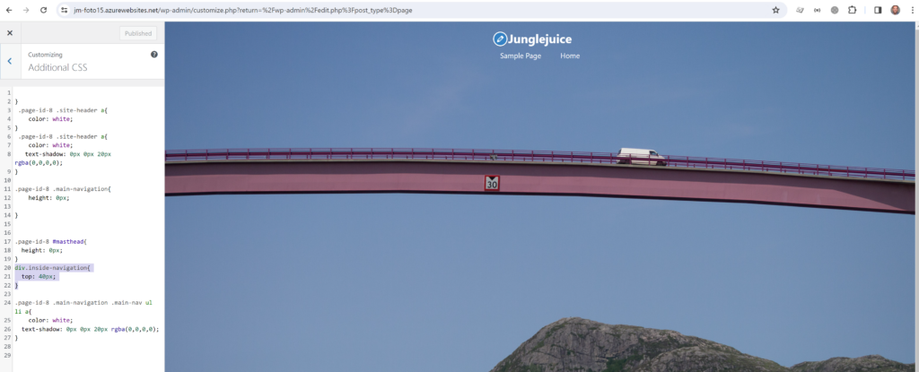
That should give you a front page with white text over a full width image like in this example from jm-foto15.
Adjust site title and Navigation alignment
Maybe your Site title and naviagtion is nit at the center as in the image aboe? If you want ti at the center do the following:
Layout > Primary Navigation > Navigation Location > Below Header
Layout > Primary Navigation > Navigation Alignment > Center
Settings > Layout > Header > Header Alignment > Center

You can change the blue Hover colour in the colour menu.
Page with an image grid
It is quite common to show an image grid on a photobased page. On the jonasbendiksen site this looks like this:
https://www.jonasbendiksen.com/projects
Let’s try to make something similar, and this time you are going to use a premade grid structure and upload it as a Pattern. You need WordPress 6.5 or higher, generatepress and generateblocks for this.
The grid we will use can be seen here:
https://gauteheggen.com/wp-content/uploads/2024/04/Photogrid_Patterns.zip
Then you have to unzip that file.
Then you need to got to Appearance > Patterns and choose ‘Import from JSON’ at the top of the Patterns page.
These grids are responsive
The 3 by 2 grid will change to 2 by 3 on tablet and 1 by 6 on phone:
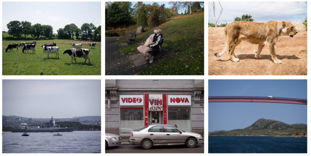
3 by 2
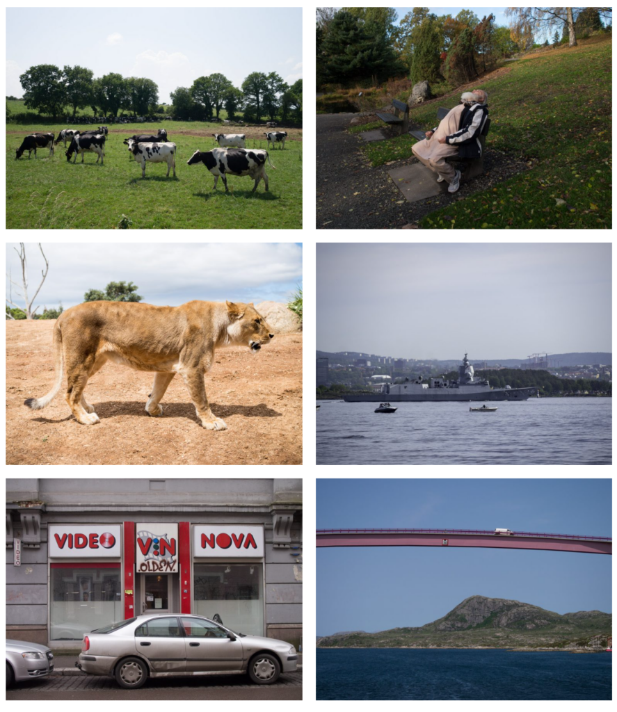
2 by 3
1 by 6
The 4 by 1 grid will change to 2 by 2 on tablet and 1 by 4 on mobile:
4 by 1
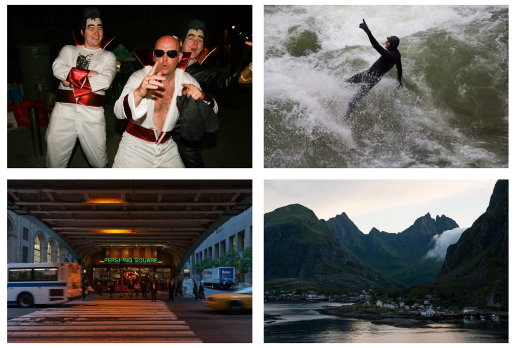
2 by 2
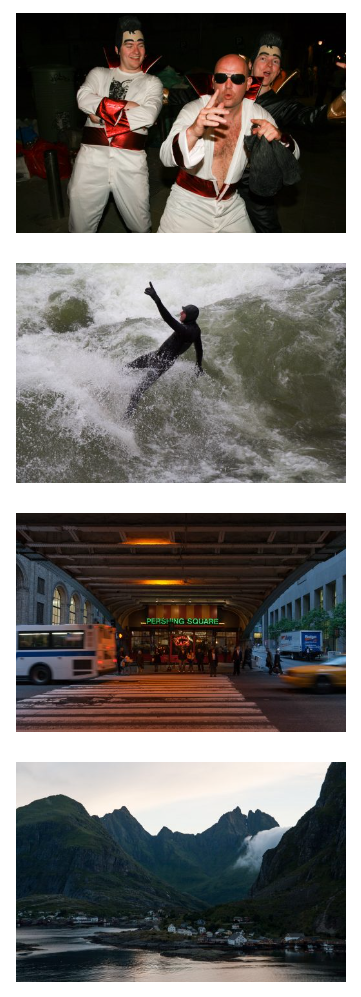
1 by 4
This is how to use the patterns on your pages:
- Choose + to add a block
- choose browse all
- Choose Patterns > My patterns
- Choose ‘EqualAspectGrid3x2’
- Replace with your own images
- You can add titles below each image if you want.
- If you want a larger grid simply add the same pattern again and again
- You can add titles, text and links to the grids
Story with large images and text
A standard article template has a limited width for the content for good reasons. Text should not be stretched across the width of a big screen because it is not good for readability. Most pages have a limited width for the content but on a photo site we want to be able to use the entire width for images and at the same time limit the width of the text.
Here is how we achive that:
- Just like on the front page choose a Full Size image to fill the entire width of the browser.
- Below this image add a container for text and any other content you want to appear with limited width.
Here is an example:
For this container to be limitied widht and centered there are a few crucial settings in the right haned panel.
- max-width should be set roughly to something like 900 pixels
- margin-left and margin-left must be set to ‘auto’ for the container to stay centered
- Now place content inside
You can of course also add this page-id to the CSS further up and paste the same CSS again to achieve the ‘transparent header over the image’ look on several pages.