This post will guide you through using CSS with the generatepress theme to customize your header and navigation elements. If you are not familiar with the Customize menu in WordPress yet I reccomend reading THIS .
Contents of this article:
Adding custom fonts in WordPress
Selectors for other header- and navigation elements
Setting a background gradient with CSS
CSS code for setting a background image
Turn the cartoony look to 11 with stroke and text shadow
Using CSS variables for the menu
Let’s move to the wordpress built in CSS panel. If you are at you Dashboard you can simply click the large blue button called ‘Customize your site’, or if you are elsewhere you can hover over ‘Apperance’ and then choose Customize.
Here is how to add some colour. In order to alter the colours you first need the right selectors. In this case you can use the selectors listed here, but you should practice using developer tools to find the selectors you want. More on that later. Let’s try the selector for the header.
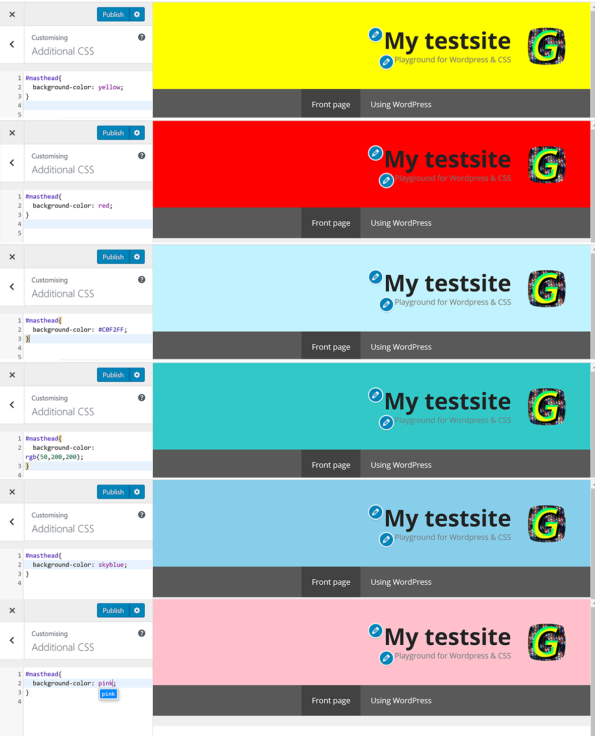
These black boxes contain code that you can copy paste straight into your own WordPress CSS. If you are using a different theme than GeneratePress the selectors might not work. The header element in this theme has an id with a value of ‘mastehead’. So that means selector with a rule for background colour looks like this:
#masthead{
	background-color: white;
}
That simply maintains the color as it is now. Try some other colours:
#masthead{
	background-color: yellow;
}
Here the colour is defined with RGB values:
#masthead{
	background-color: rgb(50,200,200);
}
And here is a colour defined with a HEX code:
#masthead{
	background-color: #C0F2FF;
}
And here are some results:
So, changing the background colour is simple enough. Here are some simple tips about picking colours that go well together.
- Use this tool: https://color.adobe.com/create
- You can choose a colour rule on the left, and then explore colour combinations with that rule.
- Initially click and drag the circle marker that has a triangle within it.
- You can then adjust the other colours idividually.
- Below each colour there is a hex code that you can copy straight into your CSS, just remember to add a hashtag before the hex code like this:
#masthead{
	background-color: #C0F2FF;
}
Adding custom fonts in WordPress
In an earlier CSS class we went through the process of adding a font from google fonts to our html / CSS projects. This section will show you how to do the same with WordPress and CSS.
The main difference is that in WordPress you do not have direct access to the head section of your website through the control panel. There is still a head section, every web page has one, but this one is generated by the WordPress CMS. If you want you can look at the head section through developer tools. Right click on you blog, choose inspect to open developer tools and then click the elements tab. You should see the head element with a triangle to the right allowing you to look inside the element. If you do this you will see that this head element is much more complex than anything we did with our html projects. Anyway, lets get to the point.
In order to link to a font in the head section of a WordPress site you need the plugin ‘Insert headers and footers’. On your dasboard go to:
Plugins > Add new
After the plugin is installed you also need to click ‘Activate’. Time to find a font you like, follow the link to google fonts:
Remember you just need to click the plus sign on the fonts you want. Too many fonts can get messy and slow down your site, but adding 2-4 fonts should be fine. While we ar e at this stage it is also worth checking out these links for parining fonts.
https://inkbotdesign.com/google-font-combinations-mixing-typefaces/
https://www.reliablepsd.com/ultimate-google-font-pairings/
https://www.figma.com/google-fonts/
…or just type ‘google font pairs’ into google and find something else.
When you have picked your fonts you will see a black bar at the bottom of the google fonts site. Click the black bar and a pop up window with two code snippets will appear. you have to copy the top of these two snippets and paste it into your head section. That means we have to use the plugin that we just installed. Hover over the ‘Settings’ option on your dashboard and then choose ‘Insert headers and footers’. There are three text fields you can put scripts into, you want ot use the on for header. Paste the google fonts code in there.
Once that is in place you can add the fonts to specific elements on your wordpress site with some CSS. Here are the fonts I chose to add. I have chosen more fonts than I reccommend, but the purpose here si to show how a variety of fonts and colours can do a lot to make your site more unique.
<link href="https://fonts.googleapis.com/css?family=Alfa+Slab+One|Bangers|Codystar|Monoton|Permanent+Marker|Press+Start+2P&display=swap" rel="stylesheet">I am going to change the font of the title in my header first, so I need the selector for that element. Here is the header with no CSS applied. Everything done here was done in the ‘Customize’ menu where I chose to align the title to the right, the navigation to the middle and I picked a logo.
In order to get the selector for your title right click the title and choose ‘inspect’. You might not get to the exact element you want to target, you need to hover around in the DOM tree a bit. In this case the inspectori initially highlights a link element <a>, but instead you should use the selector of the parent element which is a <p> element with a class name “main-title”. Other themes than generatepress might have different class anmes for the title. Use the main title class as the selector like this:
.main-title{
font-family: 'Permanent Marker', cursive;
}
Now my header looks like this:
Lets try all the other fonts as well.
.main-title{
font-family: 'Alfa Slab One', cursive;
}
.main-title{
font-family: 'Bangers', cursive;
}.main-title{
font-family: 'Codystar', cursive;
}.main-title{
font-family: 'Monoton', cursive;
}.main-title{
font-family: 'Press Start 2P', cursive;
}Here are the results in one image:
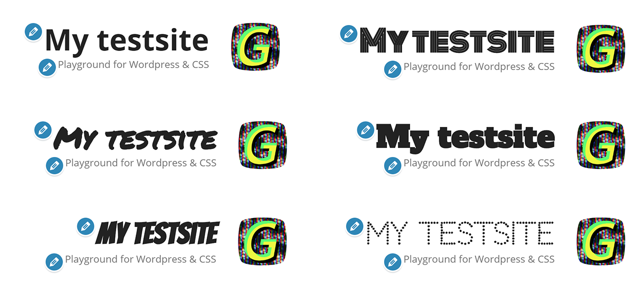
And now I realized I should have split ‘test’ and ‘site’ into two words. Oh well, the example still works for its purpose. Also, the blue little icons with the pencil are only visible when you are logged in to the Dashboard, not on the public version of the site.
Selectors for other header- and navigation elements
Adjusting background colour and title font is fine, but there are other elements associated with the header. Let’s take a look at the other elements and what selectors to use.
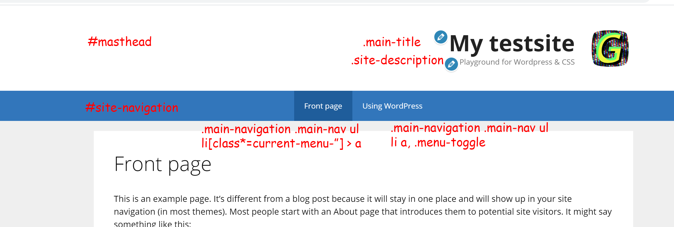
So these are some of the selectors we will be using now. Remember that these might not work with other themes. The #masthead id refers to the entire header and we already used it when setting the background colour. There are two elements inside the header with class names ‘main-title’ and ‘site-description’. We have used the ‘main-title’ class to set the custom font. There is also a selector for the logo but because the logo is easy to modify within the Customize menu I have not bothered usin CSS on it. Below the header you can see the #site-navigation which is separate to the header. It has a menu with some rather complex selectors. We will no use all of these selectors and add some CSS rules to modify the header and navigation. Lets do the background colour again. I want a black background for the header and for the navigation. Here is the code for that. If you use GeneratePress you should be able to simply copy the following code into your own CSS panel.
#masthead{
	background-color: black;
}

#site-navigation{
	background-color: black;
}
Ok, so now all the text is unreadable because it is the same colour as the background. Let’s first fix the title and description.
.main-title{

font-family: 'Bangers', cursive;

	text-align: center;
	font-size: 3em;
	color: yellow;
}

.site-description{
	color:yellow;
	text-align: center;
}
The text align center rule will in this case not center the text within the header, but it will center it within the ‘site-branding’ element that again sits within the ‘site-branding-container’. This is the nature of the html that comes out of WordPress, much more complex than our simple html pages but you also get a lot for free in terms of layout options in the Customize menu etc. More options means more complexity, get used to it.
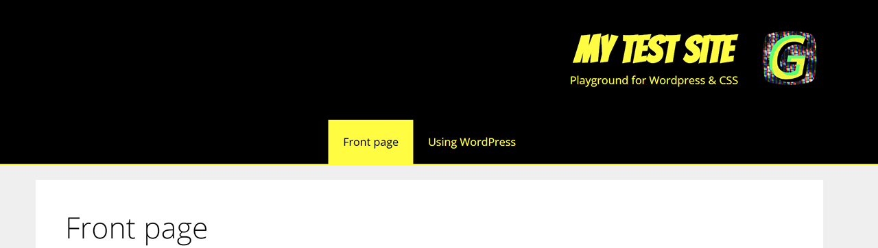
The header now looks ok but the navigation has a blur background for the current page. I want the current page to have a yellow background with black text and for the other menu elments I want yellow text. I also want a yellow underline for the entire navigation. Here is the code for that and this is the part that has the rather complex selectors.
.main-navigation .main-nav ul li a, .menu-toggle {
    color: yellow;
}


.main-navigation .main-nav ul li[class*="current-menu-"] > a {
    color: black;
    background-color: yellow;
}
These selectors are complex because they target the menu elements in different states. WordPress will automatically update the classes for the selected elements so your CSS will work no matter what menu element the user clicks. You can see that the bottom selector has a selector targeting the cirrent page and setting background colour to yellow and color (for the font) to black. Here is the result.
Setting a background gradient with CSS
Rather than a single background colour you can use a background gradient. It is quite easy and can give some nice results. An easy way to get a nice result is to go to https://cssgradient.io/.
Here you can play around with colour pickers and different kinds of gradients. You can use a radial gradient that expand in a circular fashion from the centre, or a linear gradient where the gradient spans in any direction of your choosing. You can also add more color values between the two colours at the edges. When you are happy with your gradient you can scroll down and copy paste the CSS values. Here are some CSS values and the result:
background: rgb(255,0,0);
background: radial-gradient(circle, rgba(255,0,0,1) 0%, rgba(36,0,0,1) 100%);
CSS code for setting a background image
In order to set a background image you first need to publish an image to your Media library. The background image should be very wide but not very tall. A quick google search got me to this site which has a table of reccomended image sizes for headers. I would go with at least 1920 width and for the Generatepress theme the height of the header is 183 pixels. It is a good idea to use this exact as that prevents the image from scaling vertically.
Upload your image to the media library and then click on it. You will get a dialogue box with various information about your image. At the bottoms is a partial url that you need to add to the url of your site to get a complete link to your image. It will look similar to this:
/wp-content/uploads/2020/03/header-background-skyline.jpgSo in order to use this you will have to add it at the end of your sites url. For me the url is:
http://gaute.azurewebsites.net/You will need to insert your student number where it says my name. My complete image url looks like this:
http://gaute.azurewebsites.net/wp-content/uploads/2020/03/header-background-skyline.jpgYou can copy paste the url above into your browsers address field and you should see the image. Now I put my image url into the CSS for background image so I get this:
 #masthead{
background-image: url("http://gaute.azurewebsites.net/wp-content/uploads/2020/03/header-background-skyline.jpg");
	background-repeat: no-repeat;
	background-size: cover;
}
How to disable CSS to take a screenshot
This will come somewhere, right now its just a reminder…
Turn the cartoony look to 11 with stroke and text shadow
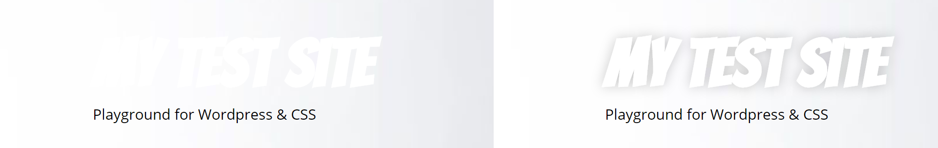
A text shadow can be used in many ways. Here are two quite different ways to add a text shadow to the title. The first way creates a hard shadow that gives a slightly cartoony font with the currently selected font. You can see this text shadow has three properties. The two 6px properties are the offset values for the shadow. It determines how far off the sadow is compared to the location of the original text. The other value is a color value, in this case it is the HEX code for black. You can use colour names, RGB values, RGBA values or HEX values.
Cartoony hard shadow
.main-title a, .main-title a:hover, .main-title a:visited {
text-shadow: 6px 6px #000000;
}
To make this title even more cartoony we can add a stroke on the outside. Unfortunately the strokes added on text are centered on the texts outline, in my opinion you should be able to have the stroke starting from the outside and moving out. The only way to achieve this is to use illustrator and then convert the text to a shape and then you can specify the stroke to start from the outside. You can read more about that onn CSS-tricks.com. Here is the CSS code for a stroke. Note that this is targeting webkit browsers and will not work in older browsers like internet explorer but it is covered by so many browsers that I think it is fair to use this.
.main-title a, .main-title a:hover, .main-title a:visited {
text-shadow: 6px 6px #000000;
-webkit-text-stroke-width: 0.6px;
-webkit-text-stroke-color: black;
} 
For readability
This adds a soft shadow with no offset and it has a 15 pixel blur radius and a 30% opacity represented by the ‘0.3’ inside the RGBA brackets. This is a good choice for making text readable if placed on top of images, especially if you don’t have full control over the image behind the text. You can see this used on Netflix subtitles and in broadcasting.
.main-title a, .main-title a:hover, .main-title a:visited {
text-shadow: 0px 0px 15px rgba(0,0,0,0.3);
}
Here are two screenshot of a title on a header background image with lots of white. I would never use a white font on a header with so much white, but it is to make an example of how to make text that is always readable.
Using CSS variables for the menu
Variables in CSS are a relatively new feature that fits perfectly with the task of adjusting the generatepress top menu with CSS. This menu has a few slightly complicated selectors and it also has many instances of the same colour under different selectors. In short it is labourious to adjust the colours even when you know the selectors. Let’s take a look:
Note! The following code is not reccomended, there are two more chunks of code further down that are better. I left this for the reference.
/*NAVIGATION CSS START*/

/*Top level elements unselected*/

.main-navigation .main-nav ul li a, .menu-toggle {
    color: yellow;
}

#site-navigation{
		border-bottom: 2px solid yellow;
	background-color: black;
	color: yellow;
}

/*HOVER unselected  top level navigation elements*/
.main-navigation .main-nav ul li:hover > a, .main-navigation .main-nav ul li:focus > a, .main-navigation .main-nav ul li.sfHover > a {
    color: #ffffff;
    background-color: red;
}

/*unselected drop down elements*/
.main-navigation ul ul {
	  color: yellow;
    background-color: black;
}

/* Hover on drop down elements*/
.main-navigation .main-nav ul ul li:hover > a, .main-navigation .main-nav ul ul li:focus > a, .main-navigation .main-nav ul ul li.sfHover > a {
    color: white;
    background-color: red;

}

/*SELECTED HOVER top level elements*/
.main-navigation .main-nav ul li[class*="current-menu-"] > a:hover, .main-navigation .main-nav ul li[class*="current-menu-"].sfHover > a {
    color: white;
    background-color: red;
}


.main-navigation .main-nav ul li[class*="current-menu-"] > a {
    color: black;
    background-color: yellow;
}

.main-navigation .main-nav ul ul li[class*="current-menu-"] > a {
    color: black;
    background-color: yellow;
}

/*SELECTED HOVER drop down*/
.main-navigation .main-nav ul ul li[class*="current-menu-"] > a:hover, .main-navigation .main-nav ul ul li[class*="current-menu-"].sfHover > a {
    color: white;
    background-color: red;
}

/*unselected drop down*/
.main-navigation .main-nav ul ul li a {
    color: yellow;
}
A quick count tells me there are seven instances of the colour value ‘yellow’ in the CSS controlling the look of the menu. This is where the varables come in handy. Rather than setting the value for every individual CSS rule that needs the same colour we can set them all to a variable and then set the value for that variable in one place rather than seven. CSS variables are very useful for working with colour themes as you can define your main colours in one place and have the changes happen across the elements you want alrered. The first time you set up your elements and your colours will be as much work as doind it the old way, but your code will be much more reusable.
I just discovered that using CSS variables in WordPress results in an error in the CSS panel. It still works but you need to tick the little check box for publishing the CSS despite errors. It seems WordPress is slightly outdated for CSS here.
Here is the same CSS mess, but this time all the colour values have been replaced with variables. If you want to read more about CSS variables check this.
/*NAVIGATION CSS START*/

:root {
  --main-contrast-color: green;
  --main-hover-background-color: yellow;
  --main-hover-color: black;
  --nav-background-color: black;
}

/*Top level elements unselected*/

.main-navigation .main-nav ul li a, .menu-toggle {
    color: var(--main-contrast-color);
}

#site-navigation{
		border-bottom: 2px solid var(--main-contrast-color);
	background-color: var(--nav-background-color);
	color: var(--main-contrast-color);
}

/*HOVER unselected  top level navigation elements*/
.main-navigation .main-nav ul li:hover > a, .main-navigation .main-nav ul li:focus > a, .main-navigation .main-nav ul li.sfHover > a {
    color: var(--main-hover-color);
    background-color: var(--main-hover-background-color);
}

/*unselected drop down elements*/
.main-navigation ul ul {
	  color: var(--main-contrast-color);
    background-color: black;
}

/* Hover on drop down elements*/
.main-navigation .main-nav ul ul li:hover > a, .main-navigation .main-nav ul ul li:focus > a, .main-navigation .main-nav ul ul li.sfHover > a {
    color: var(--main-hover-color);
    background-color: var(--main-hover-background-color);

}

/*SELECTED HOVER top level elements*/
.main-navigation .main-nav ul li[class*="current-menu-"] > a:hover, .main-navigation .main-nav ul li[class*="current-menu-"].sfHover > a {
    color: var(--main-hover-color);
    background-color: var(--main-hover-background-color);
}


.main-navigation .main-nav ul li[class*="current-menu-"] > a {
    color: black;
    background-color: var(--main-contrast-color);
}

.main-navigation .main-nav ul ul li[class*="current-menu-"] > a {
    color: black;
    background-color: var(--main-contrast-color);
}

/*SELECTED HOVER drop down*/
.main-navigation .main-nav ul ul li[class*="current-menu-"] > a:hover, .main-navigation .main-nav ul ul li[class*="current-menu-"].sfHover > a {
    color: var(--main-hover-color);
    background-color: var(--main-hover-background-color);
}

/*unselected drop down*/
.main-navigation .main-nav ul ul li a {
    color: var(--main-contrast-color);
}


.main-title a, .main-title a:hover, .main-title a:visited {

	-webkit-text-stroke-width: 1px;
  -webkit-text-stroke-color: black;


    color: var(--main-contrast-color);

	/*text-shadow: 6px 6px  #000000;*/

	 /*text-shadow: 0 0 13px #FF0000, 0 0 15px #0000FF;
	*/

	text-shadow: 0px 0px 13px rgba(0,0,0,0.2);

}

.copyright-bar{
	visibility: hidden;
}


/*NAVIGATION CSS END*/
That was a lot of CSS but what you need to pay attention to is the part on top wrapped by :root. This is where the CSS variables are defined. You can copy paste the entire block of CSS above into your generatepress CSS and only change the values of these variables to control the colours in the menu.
CSS for menu with underline effect on hover
#masthead{
	/*background-color: black;*/

	/*
	background: rgb(255,0,0);
background: radial-gradient(circle, rgba(255,0,0,1) 0%, rgba(36,0,0,1) 100%);*/
	/*
	background: rgb(89,0,0);
background: radial-gradient(circle, rgba(89,0,0,0.18841039833902307) 0%, rgba(255,0,0,0.6281863087031687) 100%);*/
	/*Here is my comment*/

	/*
	background: rgb(89,0,0);
background: radial-gradient(circle, rgba(89,0,0,1) 0%, rgba(255,0,0,1) 100%);*/


 background-image: url("http://gaute.azurewebsites.net/wp-content/uploads/2020/03/header-background-skyline.jpg");
	background-repeat: no-repeat;
	background-size: cover;


	/**/
}

.site-description{
	color: black;
}


.main-title{
	font-family: Bangers;
	font-size: 4em;
}
/*NAVIGATION CSS START*/

:root {
  --main-contrast-color: #F96FFF;
	--main-hover-background-color: yellow;
	--main-hover-color: white;
	--nav-background-color: black;

}

/*Top level elements unselected*/

.main-navigation .main-nav ul li a, .menu-toggle {
    color: var(--main-contrast-color);
}

#site-navigation{
		border-bottom: 2px solid var(--main-contrast-color);
	background-color: var(--nav-background-color);
	color: var(--main-contrast-color);
}

/*HOVER unselected  top level navigation elements*/
.main-navigation .main-nav ul li:hover > a, .main-navigation .main-nav ul li:focus > a, .main-navigation .main-nav ul li.sfHover > a {
    color: var(--main-hover-color);
	text-decoration-line: underline;

    background-color: var(--nav-background-color);
}

/*unselected drop down elements*/
.main-navigation ul ul {
	  color: var(--main-contrast-color);
    background-color: black;
}

/* Hover on drop down elements*/
.main-navigation .main-nav ul ul li:hover > a, .main-navigation .main-nav ul ul li:focus > a, .main-navigation .main-nav ul ul li.sfHover > a {
    color: var(--main-hover-color);
    background-color: var(--nav-background-color);

}

/*SELECTED HOVER top level elements*/
.main-navigation .main-nav ul li[class*="current-menu-"] > a:hover, .main-navigation .main-nav ul li[class*="current-menu-"].sfHover > a {
    color: var(--main-hover-color);
    background-color: var(--main-background-color);
}


.main-navigation .main-nav ul li[class*="current-menu-"] > a {
    color: black;
    background-color: var(--main-contrast-color);
}

.main-navigation .main-nav ul ul li[class*="current-menu-"] > a {
    color: black;
    background-color: var(--main-contrast-color);
}

/*SELECTED HOVER drop down*/
.main-navigation .main-nav ul ul li[class*="current-menu-"] > a:hover, .main-navigation .main-nav ul ul li[class*="current-menu-"].sfHover > a {
    color: var(--main-hover-color);
    background-color: var(--main-background-color);
}

/*unselected drop down*/
.main-navigation .main-nav ul ul li a {
    color: var(--main-contrast-color);
}


.main-title a, .main-title a:hover, .main-title a:visited {

	-webkit-text-stroke-width: 1px;
  -webkit-text-stroke-color: black;


 color: var(--main-contrast-color);

	/*text-shadow: 6px 6px  #000000;*/

	 /*text-shadow: 0 0 13px #FF0000, 0 0 15px #0000FF;
	*/

	text-shadow: 0px 0px 13px rgba(0,0,0,0.2);

}

.copyright-bar{
	/*visibility: hidden;*/
}


/*NAVIGATION CSS END*/
Improved navigation CSS
/*NAVIGATION CSS START*/

:root {
  --main-contrast-color: #F25CA2; ; ;
	--main-hover-background-color: #032CA6; ;
	--main-hover-color: white;
	--main-text-color: grey;
	--nav-text-color: white;
	--nav-background-color: #0433BF; ;

}

/*Top level elements unselected*/

.main-navigation .main-nav ul li a, .menu-toggle {
    color: var(--nav-text-color);
}

#site-navigation{
	/*
		border-bottom: 2px solid var(--main-contrast-color);*/
	background-color: var(--nav-background-color);
	color: var(--nav-text-color);
}

/*HOVER unselected  top level navigation elements*/
.main-navigation .main-nav ul li:hover > a, .main-navigation .main-nav ul li:focus > a, .main-navigation .main-nav ul li.sfHover > a {
    color: var(--main-hover-color);
	text-decoration-line: underline;

    background-color: var(--main-hover-background-color);
}

span.dropdown-menu-toggle{
    color: var(--nav-text-color);
    text-decoration-line: underline;

}

/*unselected drop down elements*/
.main-navigation ul ul {
	  color: var(--nav-text-color);
    background-color: var(--nav-background-color);
}

/* Hover on drop down elements*/
.main-navigation .main-nav ul ul li:hover > a, .main-navigation .main-nav ul ul li:focus > a, .main-navigation .main-nav ul ul li.sfHover > a {
    color: var(--main-hover-color);
    background-color: var(--main-hover-background-color);

}

/*SELECTED HOVER top level elements*/
.main-navigation .main-nav ul li[class*="current-menu-"] > a:hover, .main-navigation .main-nav ul li[class*="current-menu-"].sfHover > a {
    color: var(--nav-text-color);
    background-color: var(--main-contrast-color);
}


.main-navigation .main-nav ul li[class*="current-menu-"] > a {
    color: --nav-text-color;
    background-color: var(--main-contrast-color);
}

/*SELECTED drop down*/
.main-navigation .main-nav ul ul li[class*="current-menu-"] > a {
    color: var(--nav-text-color);
    background-color: var(--main-contrast-color);
}

/*SELECTED HOVER drop down*/
.main-navigation .main-nav ul ul li[class*="current-menu-"] > a:hover, .main-navigation .main-nav ul ul li[class*="current-menu-"].sfHover > a {
    color: var(--nav-text-color);
    background-color: var(--main-contrast-color);
}

/*unselected drop down*/
.main-navigation .main-nav ul ul li a {
    color: var(--nav-text-color);
}

.site-info {
    color: var(--main-text-color);
    background-color: var(--nav-background-color);
}


.copyright-bar{
	/*visibility: hidden;*/
	color: var(--main-text-color);
}


/*NAVIGATION CSS END*/
CSS for controlling most text on site
/*FONTS CSS
Make sure fonts are imported through insert headers and footer plugin*/
.main-title {
	font-family: 'Raleway', sans-serif;
	font-size: 4em;
}

.entry-title {
	font-family: 'Raleway', sans-serif;
	font-size: 3em;
}

body, button, input, select, textarea {
    font-family: "Roboto Slab", sans-serif;
}