Here is a short writeup of CSS variables. CSS variables can really speed up your WordPress/CSS work. Usin variables for specific settings, in this case colour, allows you to use one variable for many elements on your site, then change the colour for all your elements by simply changing the value of the variable, rather than changing the colour code for each element.
Use the generatepress theme with this CSS. It might work wit other themes but generally each theme has their own DOM structure and their own classes, id’s etc so it might be smart to stick with generatepress.
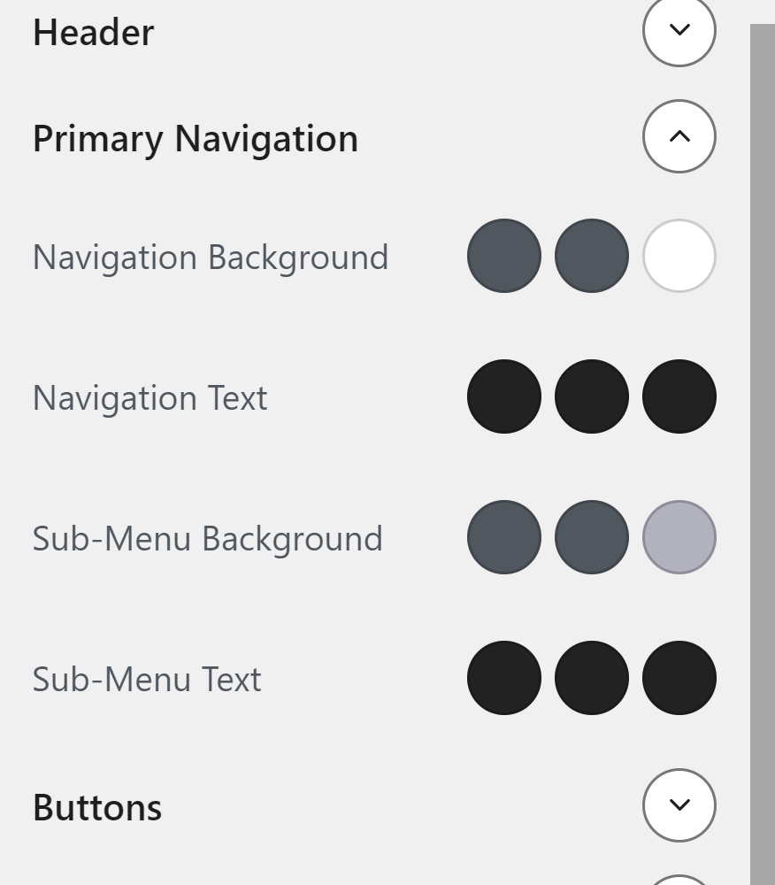
Go to the customize menu in generatepress and choose colour. We will use the CSS variables to define the colour for background and highlight in the generatepress navigation. Inside the colour menu click ‘Primary navigation’.
Primary navigation should have look like this:
You can read more about CSS variables on MDN or w3schools:
https://developer.mozilla.org/en-US/docs/Web/CSS/Using_CSS_custom_properties
https://www.w3schools.com/css/css3_variables.asp
Here is the complete CSS from class. This should work if you use the generatepress theme and might work with other themes. If you have any trouble just ask.
:root{
	--main-bg-color: white;
	--main-text-color: black;
	--highlight_text_color: red;
	--main-heading-color: black;
	--main-color: rgb(210,210,210);
	--highlight-background-color: lightskyblue;
}

#masthead{
	background-color: var(--main-color);
	/*background: #203248;*/

/*background: radial-gradient(circle, rgba(255,252,152,1) 0%, rgba(91,1,1,1) 100%);*/
	/*
	font-family: 'Tilt Prism', cursive;*/
	font-weight: lighter;
	font-size: 1em;

}


#page, #site-navigation, #masthead, .site-info{
	box-shadow: 0px 19px 18px rgba(0,0,0,0.1)
}

#masthead{
	z-index: -2;
	border-bottom: solid black 2px;
	/*border-bottom: solid var(--highlight-background-color) 2px;*/
}

.inside-header{
	padding: 0px;
}

.mybutton{
	color: red;

}

.main-navigation .main-nav ul li a {

    padding-left: 20px;
    padding-right: 20px;
    line-height: 28px;
}

.main-navigation, .main-navigation ul ul{
	background-color: var(--main-color);

}

.main-navigation .main-nav ul li a, .menu-toggle{

	color: var(--main-text-color);
}

.main-navigation .main-nav ul li[class*="current-menu-"] > a {

    color: var(--main_text_color);
    background-color: var(--main-bg-color);

}

.main-navigation .main-nav ul li:hover > a, .main-navigation .main-nav ul li:focus > a, .main-navigation .main-nav ul li.sfHover > a {


    background-color: var(--highlight-background-color);
	text-decoration: underline;
}

.separate-containers .site-main {
    margin: 0px;
}

.main-title {
    margin: 0;
    font-size: 42px;
    line-height: 1.2em;
    word-wrap: break-word;
    font-weight: 400;
    text-transform: none;
		/*text-shadow: #FC0 1px 0 10px;*/
}

.site-info {
    color: var(--main-text-color);
    background-color: var(--main-color);
	padding: 20px 0px 20px 0px;
	margin-left: 20px;
	margin-right: 20px;
	margin-left: auto;
	margin-right: auto;
}