This is a recipe for a inline-block element that can sit within a responsive flexbox or grid layout. It uses an image and a title as a call to action for the user into reading the full story. You know, clickbait 😛
NOTE: In order to use this element you need a page skeleton with a flexbox with scaled flexbox items. You can find code for that here.
You can download a working front page example here
Here is a functioning site with images and front elements set up in a flexbox
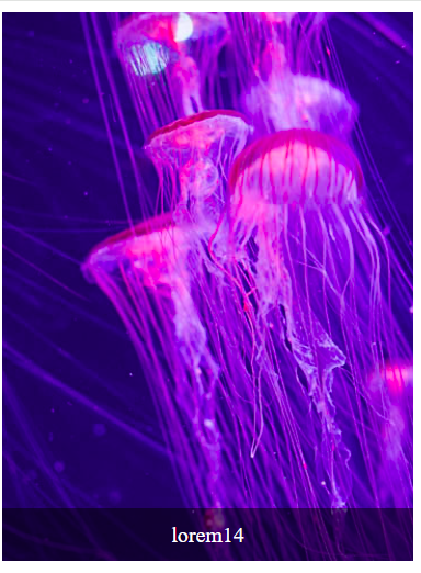
The starting point of this was a simple element that places some text aligned to the bottom if an image. The image fills the element. It looks like this:
This is a start, but I want a more news page front page view for this. So a large white on black clickable title and possibilities for a topic title that sits on the edge between the image and the title, and also space for more text.
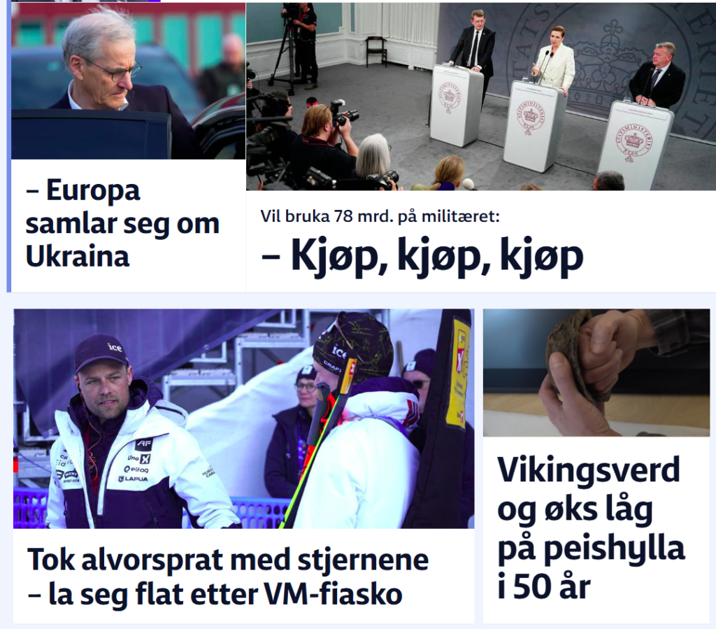
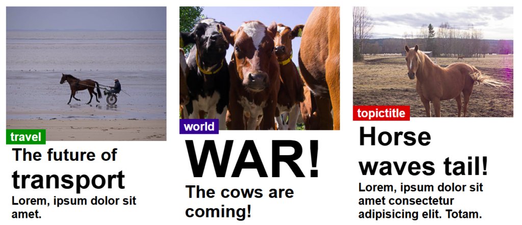
This is a good example from VG of what I want:
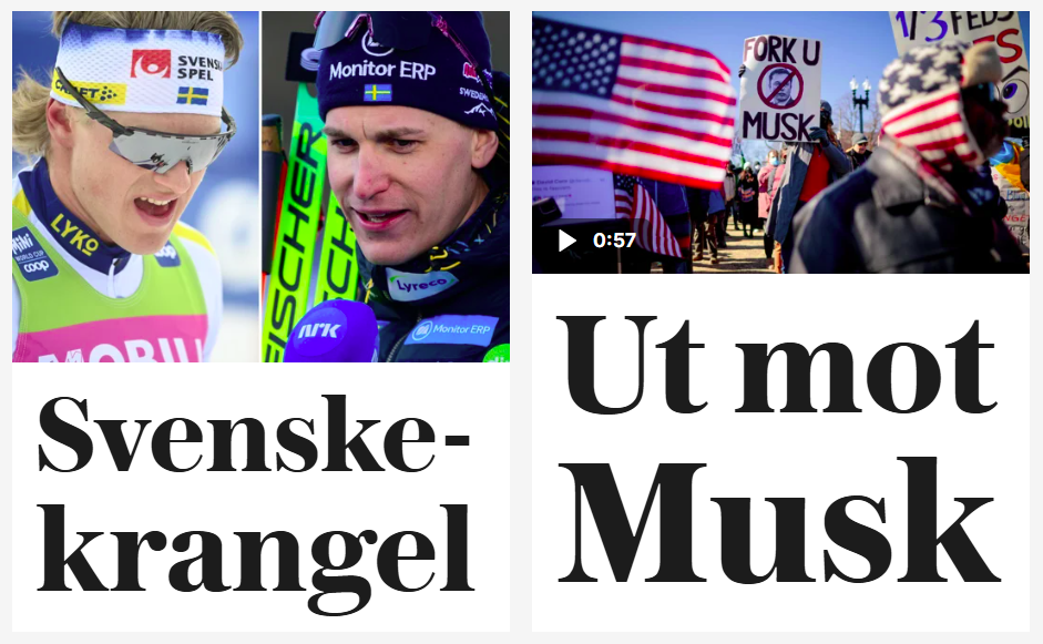
This is the tabloid way of getting us to read their stories. Here is a similar example from nrk.no:
Both varieties have title at the bottom and a picture that covers. Nrk goes a bit further than VG in making every box full width on mobile:

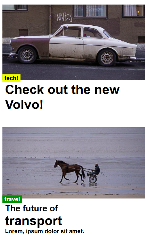
Here is what I came up with:
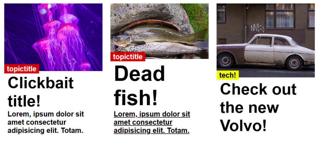
On phones it will ook like this:
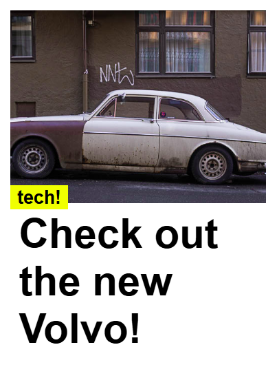
This element is meant to sit withing a flexbox or grid layout and is set to 100% width with a fixed height. This is the html code for the element:
                <div class="image-title-container">
                    <a href="aboutme.html">
                        <img style="height:66%;" src="../img/horsecarriage.jpg" alt="Jellyfish">
                    </a>

                    <div class="title">
                        <h6 style="background-color: green;" class="topic-title">travel</h6>
                        <div class="text-bg">
                            <h4>
                                <a href="aboutme.html">The future of</a>
                            </h4>
                            <h2>
                                <a href="aboutme.html">transport</a>
                            </h2>
                            <h6>
                                <a href="aboutme.html">Lorem, ipsum dolor sit amet.</a>
                            </h6>
                        </div>
                    </div>
                </div>
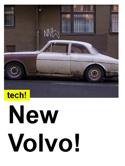
Within this code YOU need to change:
- the inline css for image height. Use a percentage and choose whatever suits your image and title
- The titles are active links. Adjust the font size by using different types of headings (h1-h6)
- A short title might require a larger title type such as h1 to fill the space
- For longer titles use smaller headings (h2-h6). Check how the title can change with various screen widths using the inspector.
And here is the CSS:
.image-title-container {
    display: inline-block;
    position: relative;
    width: 100%; /* Adjust the width as needed. 100% works well within well scaled flex-item boxes */
    height: 400px; /* Fixed height */
    overflow: hidden;
}

.image-title-container img {
    width: 100%;
    height: 75%;/*This value can be useful to set manually with inline css*/
    object-fit: cover; /* Ensures the image covers the container */
}

.title {/*This element holds all text elements aligned with the bottom*/
    position: absolute;
    bottom: 0;
    width: 100%;
    text-align: left;

    font-family: 'Times New Roman', Times, serif;
    color: rgb(0, 0, 0);
    padding: 2px 0;
    font-size: 2rem;
    box-sizing: border-box;
}

.text-bg{
    padding-top: 8px;
    background: rgba(255, 255, 255, 1); /* Semi-transparent background */
}

/*Override default link styling and colour*/
.title a{
    text-decoration: none;
    color:black;
}

.title a:hover{
    text-decoration: underline;
}

.topic-title{/*Can be used between image and title*/
    position:relative;
    display:inline;
    margin-top: 8px;
    top: 8px;
    padding: 2px 8px;
    color: white;
    background-color: rgb(213, 2, 2);
    z-index: 900;
}
/*reduce margins top & bottom for headings within teaser boxes*/
.text-bg>h1{
    margin: 0px 10px 0px 10px;
}
.text-bg>h2{
    margin: 0px 10px 0px 10px;
}
.text-bg>h3{
    margin: 0px 10px 0px 10px;
}
.text-bg>h4{
    margin: 0px 10px 0px 10px;
}
.text-bg>h5{
    margin: 0px 10px 0px 10px;
}
.text-bg>h6{
    margin: 0px 10px 0px 10px;
}
You might choose a shorter or longer title and need to adjust the title accordingly:
A longer title using H2
Or a shorter title using H1