This grew out of a request to use a flexbox in a header to control positions for logo and site title. As a bonus this also has a flexbox layout for the menu, as opposed to the list used in the other navigation layout. It also uses css varibles to set colour which can save work. This header + navigation should be usable for a small site with 2-5 categories.
The CSS assignment in this course is to make a layout without use of javascript, only html & css. I started with this prompt to chatGTP:
html css responsive header and navigation with no javascript or external dependenciesThat gave a starting point. From that I made the header + nav rest in a flexbox so the header and navigation rest side by side. This gets the navigation further up, saving some screen space:
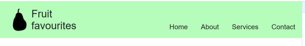
Wide screen layout
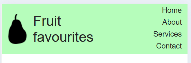
iPhone 5, 320px
The following code has inline CSS. I suggest pasting the CSS into your external style sheet to use on several pages. Always check that there are no competing (identical) class-, id- names or competing css for the same element type.
Notice that right after the <style> tag there is some code saying :root { … This sets CSS variables for this page. CSS variables can save you a bit of work when altering colours on your site. For example, the green in the screenshots above is set as background colour on three elements: The header, the navigation and the div container that holds both the header and navigation. In order to change the background colour for all threee elements all you need to do is change the value of the CSS variable ‘header_nav_bg’.
<!DOCTYPE html>
<html lang="en">
<head>
    <meta charset="UTF-8">
    <meta name="viewport" content="width=device-width, initial-scale=1.0">
    <title>Responsive Header & Nav</title>
    <style>
        :root {
        --blue: #1e90ff;
        --white: #ffffff;
        --grey: rgb(37,37,37);
        --header_nav_bg: #b6fdbb;
        }

        body {
            margin: 0;
            font-family: Arial, sans-serif;
        }

        .header-nav-flex{
            display: flex;
        }

        nav{
            width:40%;
            background: var(--fruitgreen);
        }

        .header-logo-title-flex{
            display:flex;
        }

        header {
            background:var(--fruitgreen);
            width: 60%;
            color: rgb(40, 40, 40);
            padding: 15px 0px 15px 0px;
            text-align: left;
            font-size: 1.5em;
        }

        .logo{
            width: 54px;
            margin-left: 20px;
            height:auto;
        }

        .width-container{
            max-width: 960px;
            margin-left: auto;
            margin-right: auto;
            padding:0px 0px;
        }

        .width-container .nav{
            text-align: left;
        }

        .nav {
            display: flex;
            justify-content: right;
            background: var(--fruitgreen);
        }

        .nav a {
            color: rgb(37, 37, 37);
            text-decoration: none;
            padding: 50px 15px 10px 15px;
            display: block;
        }


        .site-title {
            color: rgb(37, 37, 37);
            text-decoration: none;
            padding: 0px 0px;
            display: inline-block;
        }

        .nav a:hover {
            text-decoration: underline;
        }

        @media (max-width: 500px) {
            .header-nav-flex{
                /*flex-direction: column;*/

            }
            .nav {
                flex-direction: column;
                align-items: right;


            }

            .logo{
                margin-left: 0px;;
            }

            .nav a {
                text-decoration: none;
                padding: 3px 10px;
                text-align: right;
                font-size: 0.8em;
            }
        }
    </style>
</head>
    <body>
        <div class="header-nav-flex">
            <header class="header">
                <div class="width-container"><div class="header-logo-title-flex"><img class="logo" src="../img/pear_64.png"><span class="site-title">Fruit <br> favourites</span></div>
            </header>
            <nav>
                <div class="width-container nav">
                    <a href="#">Home</a>
                    <a href="#">About</a>
                    <a href="#">Services</a>
                    <a href="#">Contact</a>
                </div>
            </nav>
        </div>
    </body>
</html>