This article shows you how to make a few changes to your header that will let you alter site wide or page specific settings. This should give you close to full control over the apperance of your header using only free tools. This is a follow up on a guide to set up a photo portfolio using WordPress with generatepress theme and some specific free plugins. In this part we want to get more control over the visual expression of the site by changing the font.
Contents:
- Tools used
- Site title and header (via Customize menu)
- Navigation (via customize menu)
- Fonts
- Web fonts from fonts.google.com
- WP code lite plugin
- Import font
- CSS
- Selectors
- CSS rules
The font can have a big impact on how your site is preceived, maybe even more so if your page has a clean layout with few but important options such as this case with a photo portfolio.
Tools used:
- Required: WordPress 6.5 or higher (Not wordpress.com!)
- WordPress 6.5 allows exporting and importing patterns (layout elements) as .json files. This makes it much easier to share layou elements between WordPress installations.
- Must have admin user access
- Student blogs at oslomet have limited access to WordPress .php files. This article takes that into consideration so all changes are done with free plugins and CSS.
- Reccomended: Generatepress theme
- Generatepress has good performance and gives full control over page layouts.
- Other themes might work with methods described but a theme that allows full width page editing is reccommended.
- Reccomended: Generateblocks plugin
- Generateblocks gives even more layout control and works really well with pattern sharing.
- Required: WP Code lite (or similar) plugin
- WP code lite lets us import fonts from external font libraries (fonts.google.com will be used as an example here)
- Reccomended: WP SmartCrop plugin
- WP smartcrop lets us set a focal point in an image so we can control what image elements are visible on a cropped mobile display. This is importabt if you have an image with the main subject off centre.
- You can also choose to not crop your image on any display, but then it will be thumbnail sized on and upright phone screen.
WP code lets us import any font from fonts.google.com
Site title and header
Every website has a title that identifies the entire site for the user. This site title sits within the header (the top ‘banner’ on the site) and it is possible to display a logo next to it. For the photo portfolio it was an aim to keep everything clean which in turn makes the site title and its appearance even more important. We decided we want to make the header transparent and display site title and navigation on top of photos. For this to work well we have to be careful selecting what photo to use and what font to place on top of it and what colour we choose for that font.
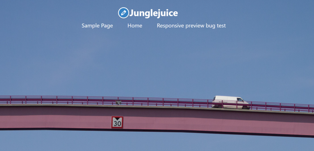
This is a starting point based on the previous article. It has a transparent header with a photo underneath. This image works okk since it has even colour and brightness across the top of the image. The font is a default font in white. Let’s see how we can alter this just using the menu options in generatepress.
Go to:
Appearance > Customize > Site Identity
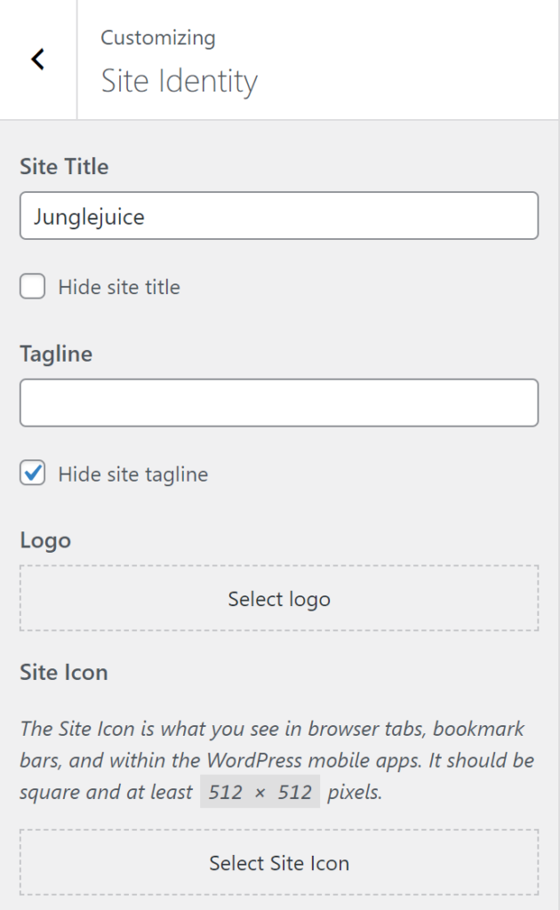
This lets you change the site title (Junglejuice). You can add a Tagline or maybe not if you want to keep it nice and tidy. You can also add a logo which can be visible next to the site title and you can add an icon. The icon will be visible on the tab in the browser and can serve as an important identifier for your site among all the other tabs. We won’t bother with logo and icon in this article. Just know that it exists and that you have these options in this menu.
In the previous article we set the header to be transparent, we set the default site-title color to be black and then we made an exception for the front page to have white site-title and navigation using CSS. We will use that as a strating point and then try some variations.
Navigation
Add a menu
Making a custom menu allows you to decide exactly what options are presented to the user. For this to make sense you first need a few pages to add to the menu as we did in the previous article.
From the site identity menu click ‘<‘ to go one step up in the menu
Then click:
>Menus
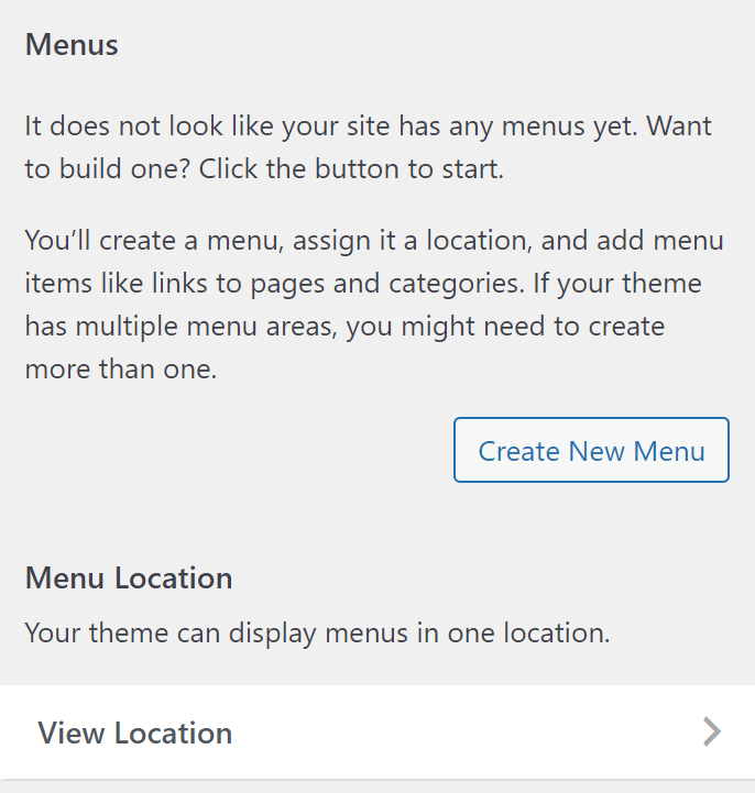
If you already have an existing menu click on that. In this case there is no existing menu so we make a new one. Click ‘Create new menu’.
You can call the new menu ‘Main’ or something else. You can make as many menus as you want, but we want to keep it simple so one menu should be plenty. Also click the checkbox to make this a Primary menu
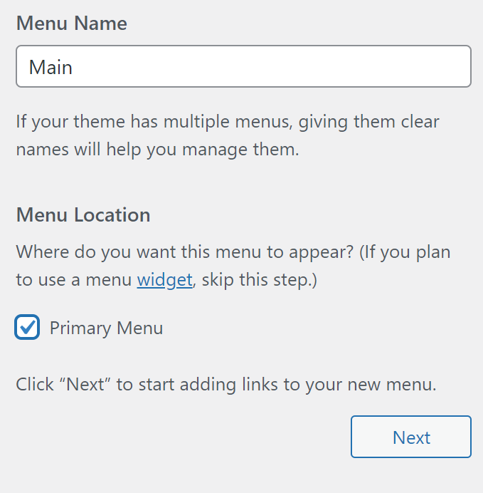
The add items to the menu:
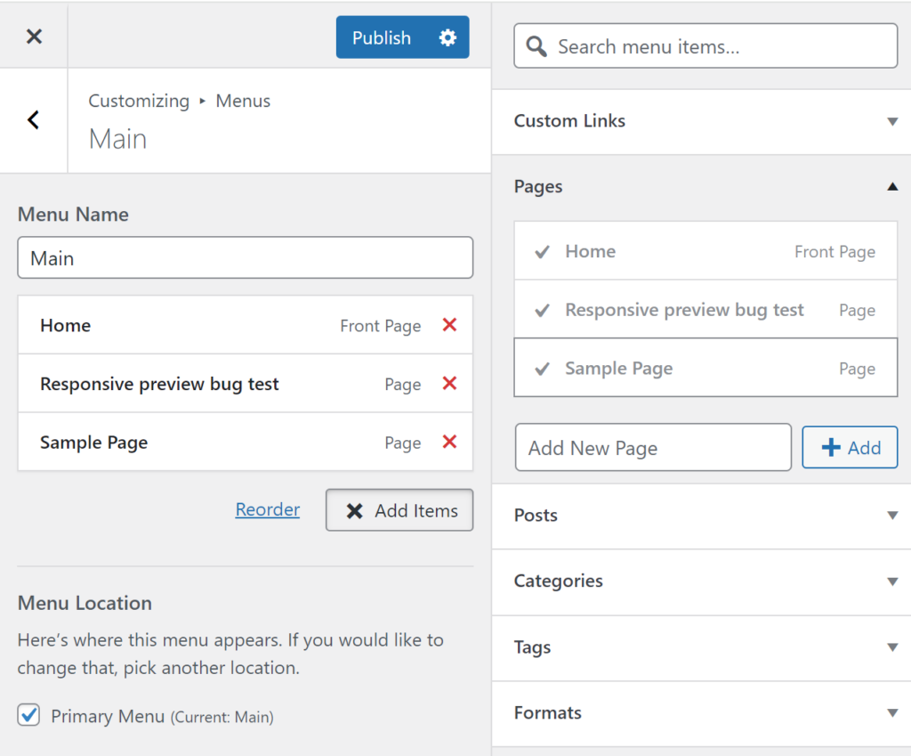
The clickable label in the menu is by default set to the page title. You can change this by altering the navigation label. ‘Responsive preview bug test’ is a pretty bad label so I will rename that to ‘Portfolio’.

In order to do this click on the menu element you want to alter:
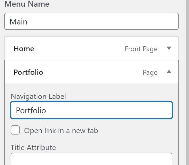
Here ‘Responsive preview bug test’ has been altered to ‘Portfolio’ and ‘Sample Page’ has been altered to ‘Projects’.

This is how you control the options for the user. The site title is also a bit silly and can be changed in ‘Site identity’ described furher up.
Now we have control over the wording for the site-title and the menu options. This is important if we want to present the user with a few tidy options.
Once you are happy with your menu click ‘Publish’ to save your changes. You can always change this later.
Now let’s see how we can position these elements still only using the menu’s for the site.
Go back to the ‘Customize’ menu by clicking ‘<‘.
Then click:
Layout > Header
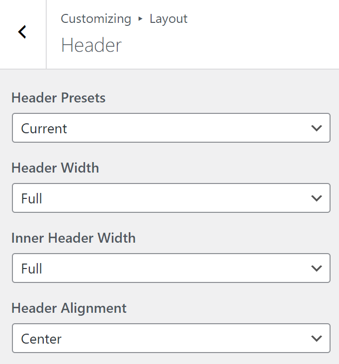
Set ‘Header width’ to ‘Full’ and ‘Inner header’ width to ‘Full’.
You can choose to place the site-title (and logo if you enable it) to be positioned left, right or center. I will keep it in the center. Again just be aware that you have this chioce in this menu.
Click ‘<‘
Then click ‘Primary Navigation’
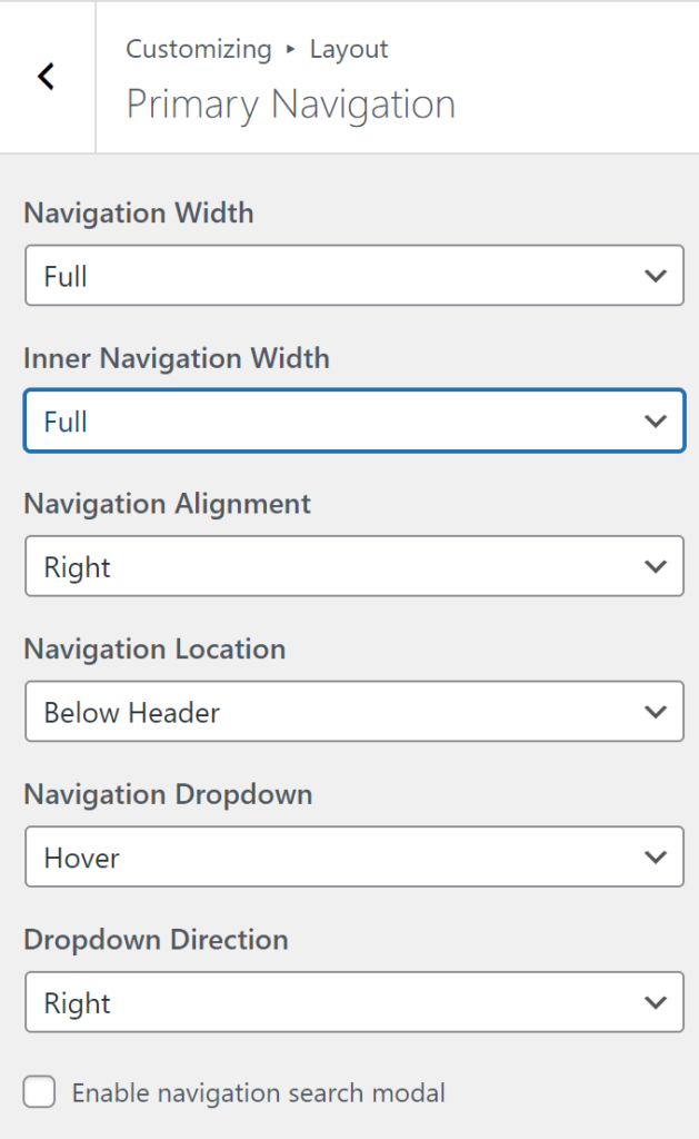
Here you have the samep options for the navigation. Again I reccommend ‘Navigation width’ and ‘Inner navigation width’ to be set to full for a photo portfolio. Otherwise the navigation will position itself according to the default content container width but we try to avoid that with the photos. You can also choose to place the mavigation above the header, but because we are already positioning these elements with CSS that will have limited effect.
Now you should know a bit more about the options available in the Customize menu. It is time to introduce some fonts
Fonts
Adding a custom font on site-title and navigation can have a big imapct on your site. This is typically something WordPress theme makers would make us pay for so lets do it for free with some CSS instead.
First, a short description of common font types. There are three main types of fonts:
Serif fonts have little feet on the letters and are commonly seen in books and print media. Here is an example
This is a serif font called Times New Roman
Another common font type are sans-serif fonts. These do not have little feet and are commonly used on screen based media because they are generally easier to read on screen. Modern high resolution screens are more capablw of rendering serif fonts in a good way, but in our low resolution pixelated recent past sans-serif fonts were much better.
This is a sans serif font called Helvetica
A third quite common font type are monospace fonts. The common characteristic for these fonts is that each letter has exactly the same widht. This makes these fonts align very well so they are commonly used in computer code and movie scripts:
This is a monospace font called Roboto mono
A fourth kind of font could be called decorative fonts. These are all the funky looking or handrwriting looking fonts that can really stand out. Personally I find that when I use one of these I like it for 30 minutes and then get bored with it, but go ahead and try. It can really give your site a unique look.
Web fonts from fonts.google.com
When we choose fonts on our own computers we can choose among the fonts that are installed on that computer. If we make a web page with one of these fonts we have no guarantee that the user at the other end has the same font installed on their computer. This is not a big problem with common serif and sans-serif fonts such as Arial, Helvetica, Times New Roman and a few others. But if we want something a bit more special it might be a problem. Therefore we must import the fonts we want to use into our web pages. We use the ‘WP code lite’ plugin described further up to import fonts and in this example we will import fonts from fonts.google.com. Go ahead and open fonts.google.com in a new tab now and start looking for fonts.
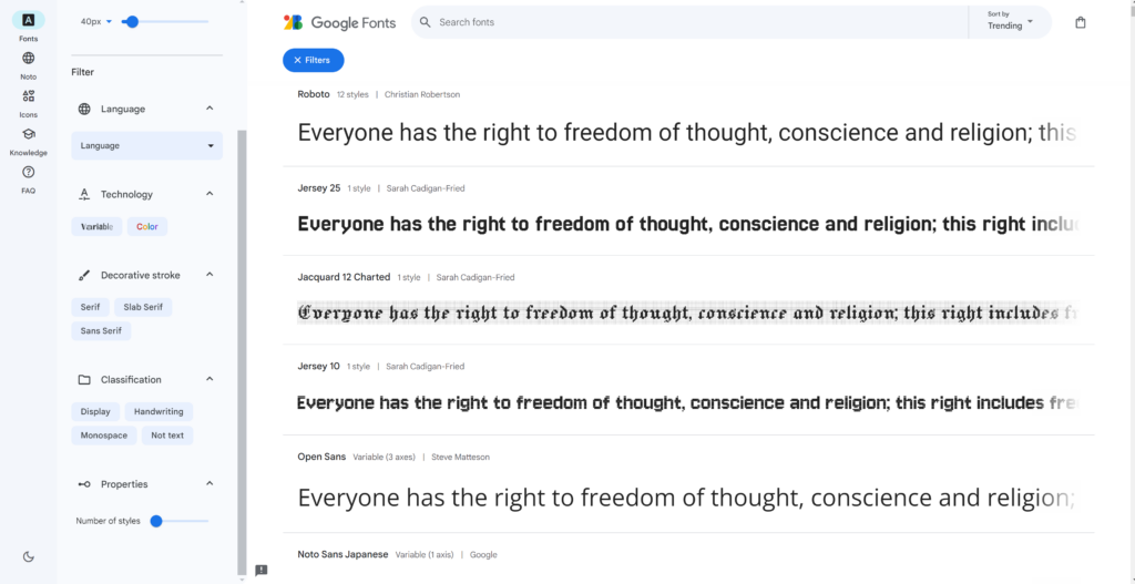
You will se a screen like this (The appearance might change, it has in the past). You can choose a few filter on the left such as the font types mentioned above, serif, sans-serif, monospace, Display, Handwriting and a few more. This should help you narrow down what kind of font you want.
For this example to be clear I will choose a fint in the ‘Display’ category. That will make my font choice stand out more than if I chose a more plain serif of sans-serif font. A more discreet font might be exactly what is right for your page so don’t feel any need to go overboard in your font choice.
The first font I will try is ‘Amatic SC’. It’s slim with lower case letter that are just small uppercase letters

In order to get this font on my web page I have to click:
> ‘Get font’ (the blue button)
then:
> ‘Get embed code’
That gives us this window:
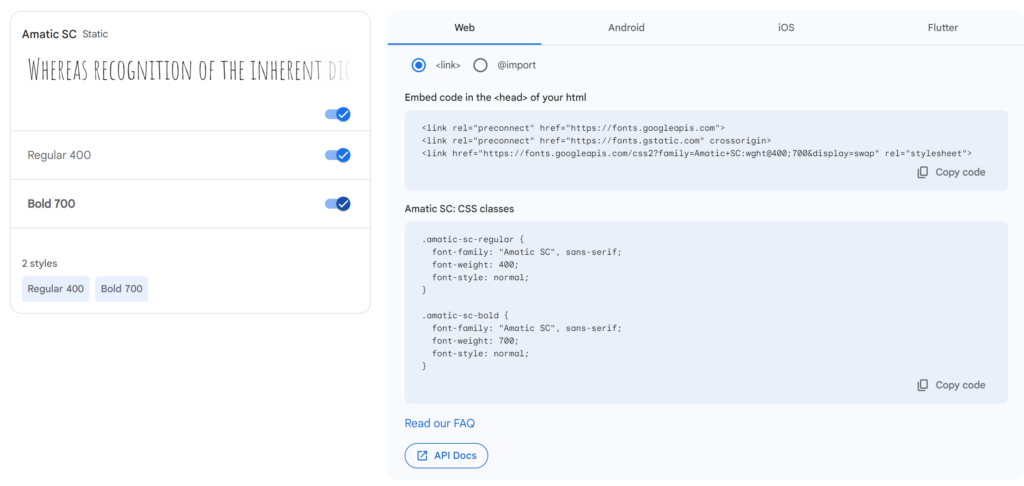
We will use the two windows with code on the right side to get the font on our page. You can choose several fonts and this code will update to include more fonts. Try a few fonts but I reccommend to choose maybe one decorative font and one font for paragraph text. For the paragraph font make sure it has good readability. You can also look at pages about font pairing to get some typographic inspiration:
https://fonts.google.com/knowledge/choosing_type/pairing_typefaces
Ok, lets focus on getting this font into our WordPress page again.
Click on ‘Copy code’ in the top of the two code windows. then head back to WordPress.
If you have ‘WP code lite’ installed you should have this option:
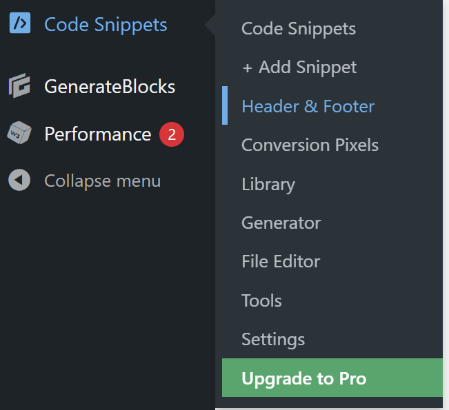
Click on ‘Header & Footer’
Paste the code from google fonts into the top text box called ‘Header’
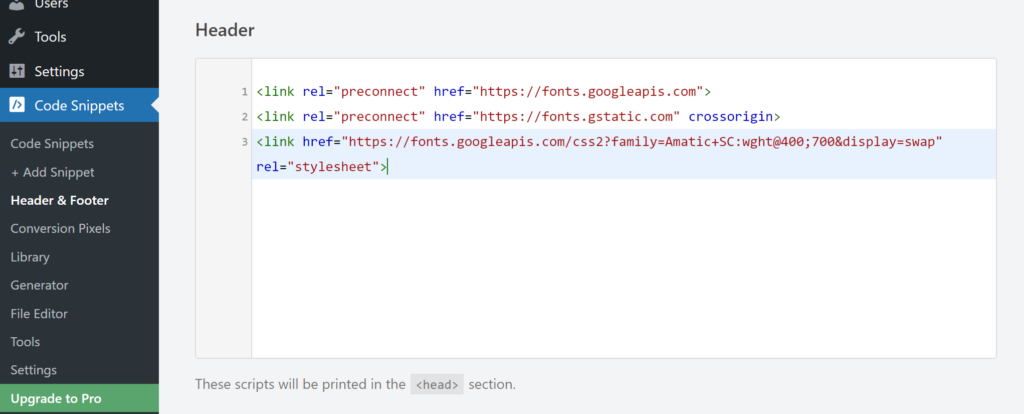
This will import the font in to your site. Click ‘Save changes’ and then go to:
> Appearance > Customize
>Additional CSS
Now we want to activate that font with CSS for our site-title and maybe for the navigation as well:
Go back to fonts.google.com and click ‘Copy code’ on the 2nd code box.
Paste it into the CSS window in wordpress and nothing should happen yet. We have to adjust the selector so WordPress set this font for the element we want. The selector is the part before the curly bracket.
Selectors might be different between different WordPress themes. In the code below the selector is ‘.main-title’. It tells the browser what element on the page these css rules should apply to. For generatepress and quite a few other themes the following selector (.main-title) should work to select the site-title so we can change its appearance:
.main-title  {
  font-family: "Amatic SC", sans-serif;
  font-weight: 700;
  font-style: normal;
	font-size: 2em;
}
This code will set the font-family (font type) for the main title. it then sets it to a slightly bold variant (font-weight) and it sets the font-style to normal (as opposed to bold or italic) and it sets the font-size to 2 em (em is a unit where 1 em is ‘normal’ font size as the font would normally be scaled in theis element. 2 em is then double that size.
This will work if you have chosen and imported Amatic SC as I have done. If you chose a different font from fonts.google.com you have to combine that font-family with the selector (.main-title) in the code example above.
I then get this look on my site title:

The buttons with pencils are only visible in the WordPress editing menu by the way.